Words by Sueanne Marie V. Billones
As part of the internship program at On-Off Group, I was required to complete a project with the objective of applying all the steps in the UX design process— from picking a topic to conducting user interviews and creating a hi-fidelity prototype. Though there may still be a few kinks in my output, I was able to complete the process and I can confidently say that I am one step closer to being a UXer.
As an avid skincare enthusiast myself, I’ve often experienced navigating through the aisles at my nearby Watsons. Even casual browsing through their selection can be confusing, trying to make sense of it all. The skincare aisle presents you with the paradox of choice.
And I’m not the only one who has felt overwhelmed. I’ve heard countless horror stories of breakouts, rashes, stinging, and other allergic reactions from friends trying out products that claim to give them the perfect complexion. Oftentimes, my friends have chosen products based on what's worked for their peers, as opposed to looking for something that would address their specific concerns.
Nowadays, there is a plethora of resources that one could browse through to help consumers find the most suitable product for them— but this in itself poses another problem. Not every consumer is willing to practice their due diligence when buying a skincare product. This means that consumers would be purchasing these products without being fully informed of its properties and effects. I decided to use this common dilemma of skincare confusion as the problem area of my UX project.
Being that I could be considered as a real end-user, I had prior knowledge of the matter but I knew that I needed to validate my assumptions through formal research. Once I established the problem I wanted to focus on, I rephrased it into the statement format of “How Might We...?”. So instead of “Skincare consumers are unable to make informed decisions on their purchases.”, I rephrased to:
How Might We… help skincare consumers understand which products would best suit their needs?
In order to validate my initial problem statement, I conducted online User Interviews with 20 consumers through Google Meet. My participants were between the ages of 17 to 32 years old who follow a skincare routine on a regular basis. This allowed me to gain a deeper understanding into their main motivating factors for purchasing and how they go about making informed decisions.
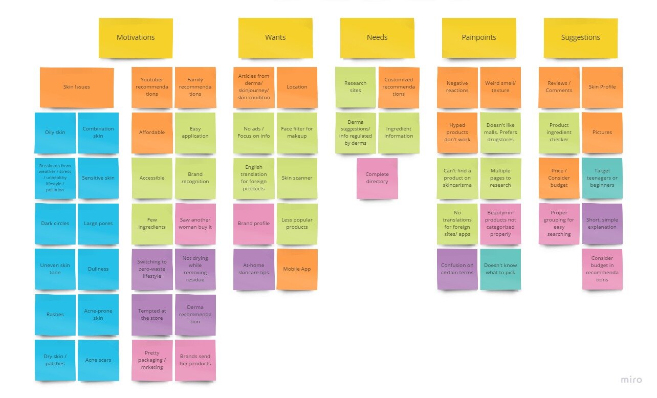
The User Interviews revealed that:
Almost all participants experienced some sort of negative experience after starting on a new product whether it be mediocre results to severe breakouts or rashes.
When probed about the factors that influence their purchases, it could be summed up:
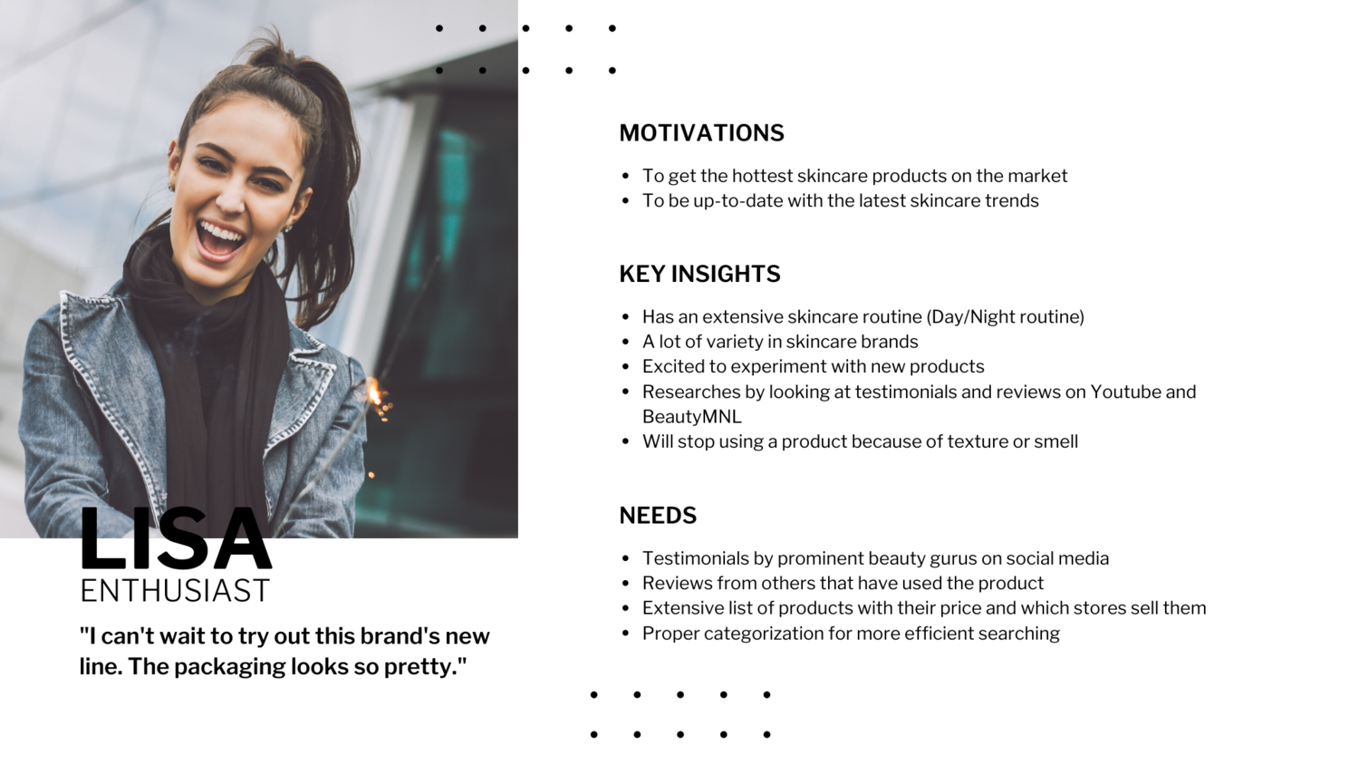
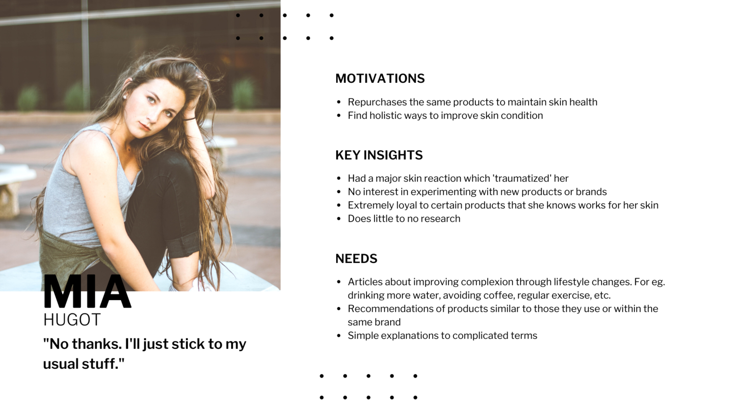
As I compiled the data, I was able to spot trends that allowed me to develop four different User Personas. Making a persona is a UX method that is used to humanize all the results gained from the interviews. Personas help give a narrative to your insights and give focus to your solution by prioritizing the target user’s needs.
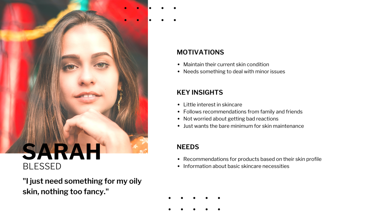
For the initial iteration, I chose to drive my solution to cater to the ‘Picky’ persona, Sam.
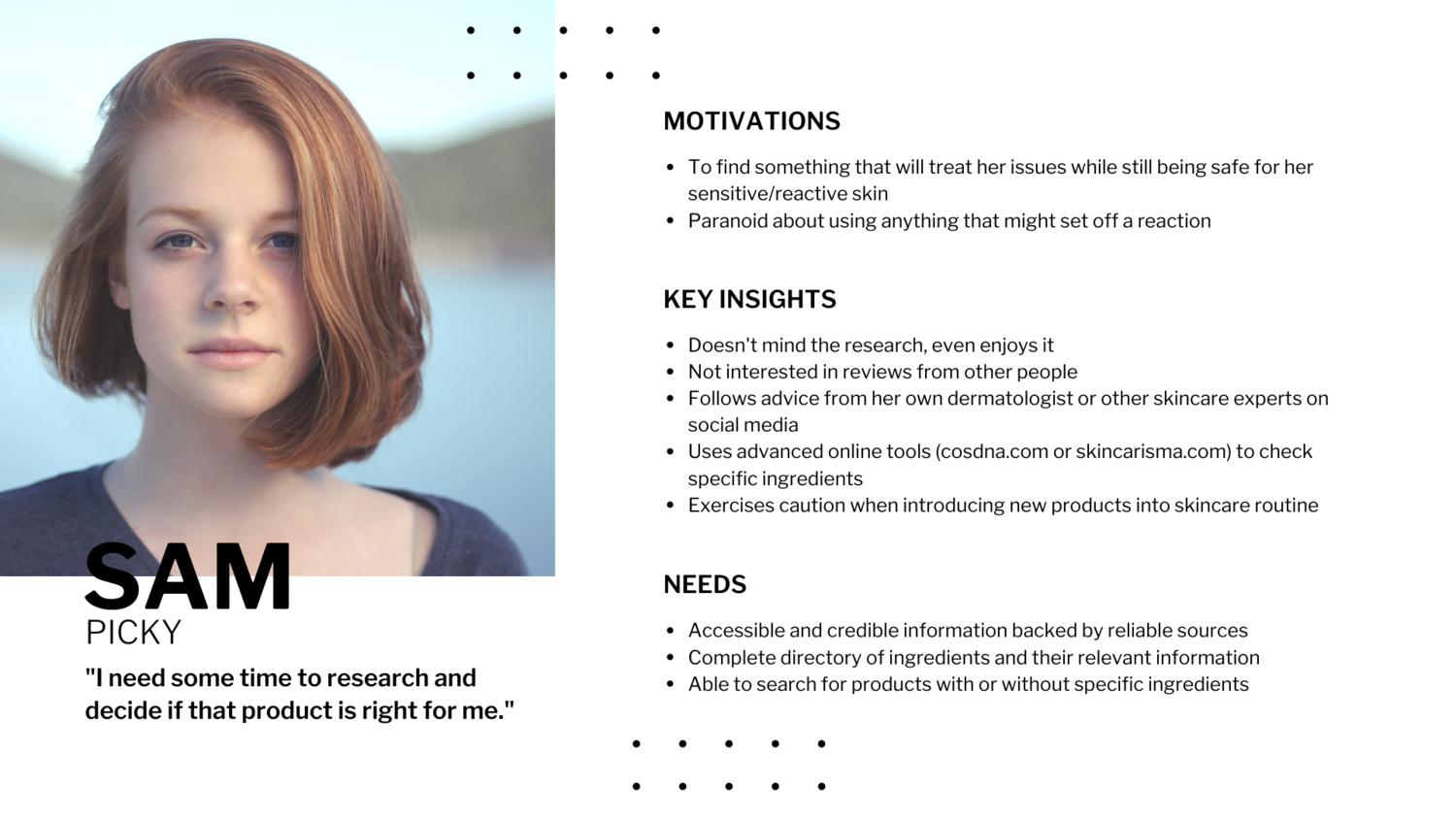
Sam has very sensitive and acne-prone skin, and has had a lot of breakouts in the past from using different products that weren’t compatible with her skin. She’s very careful about trying out new products because she’s worried that it might set off another reaction. So, she does extensive research before deciding whether or not to buy it. I wanted to build a solution that would help Sam find products to suit her unique skin issues in a more efficient and timely manner.
After choosing my Persona of focus, I then moved on to the design phase. Based on my insights, I narrowed it down to three main features that I believe would not only benefit Sam but also the other personas. My foremost insight was that:
Recommendations play a large role in helping most users decide which products to purchase.
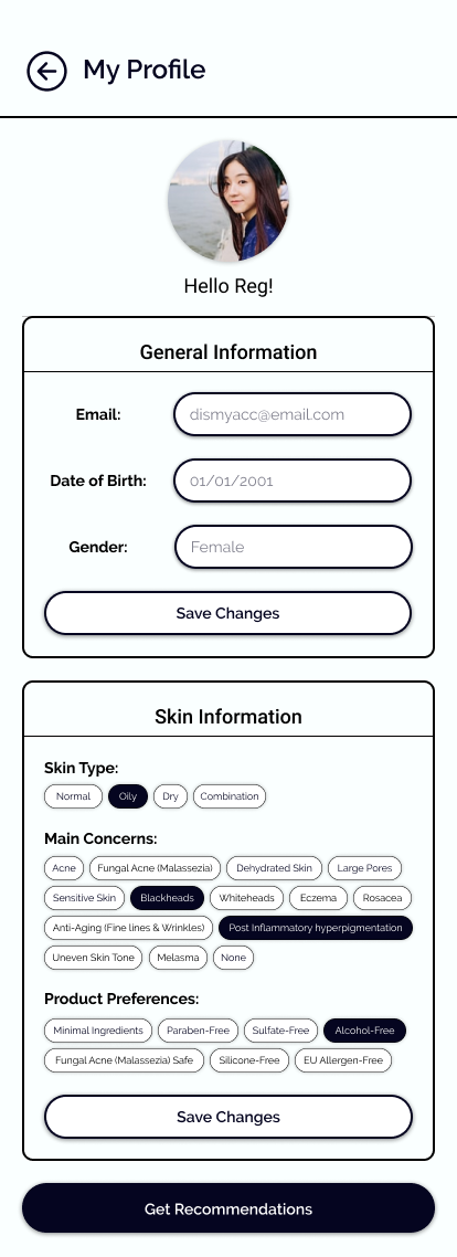
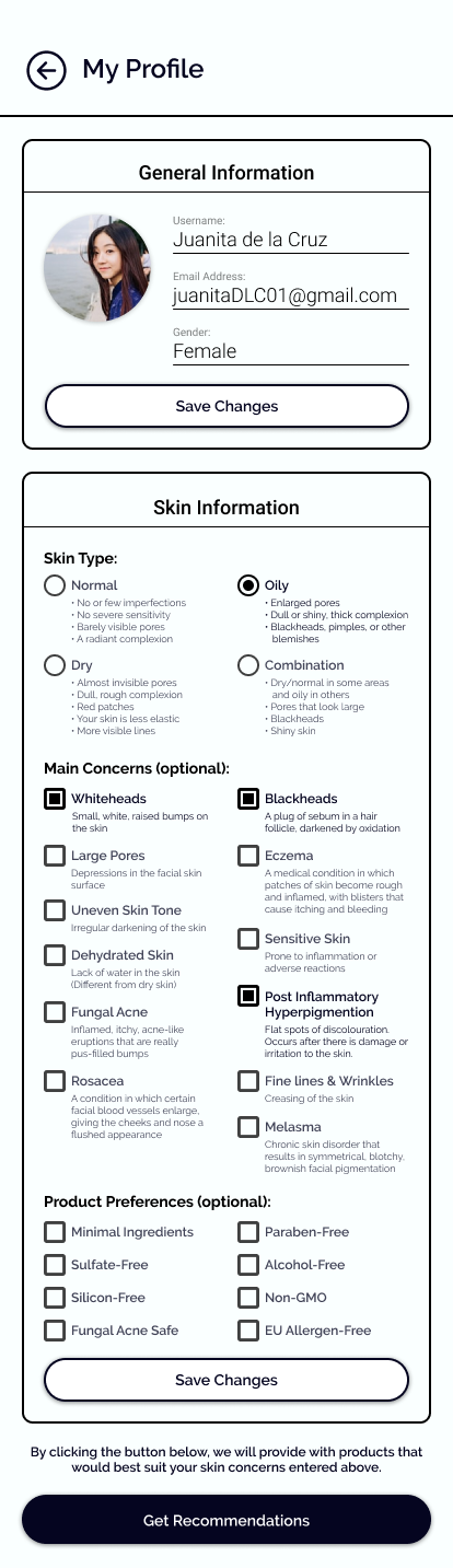
I would need to build a feature to accommodate that. That led me to implement a ‘Skin Profile’ feature wherein the recommendations could be viewed. My second insight was that:
When people start doing their own research on a particular product, most of them tend to look at reviews, and then sift through each one, trying to find a person with a similar skin type or concern.
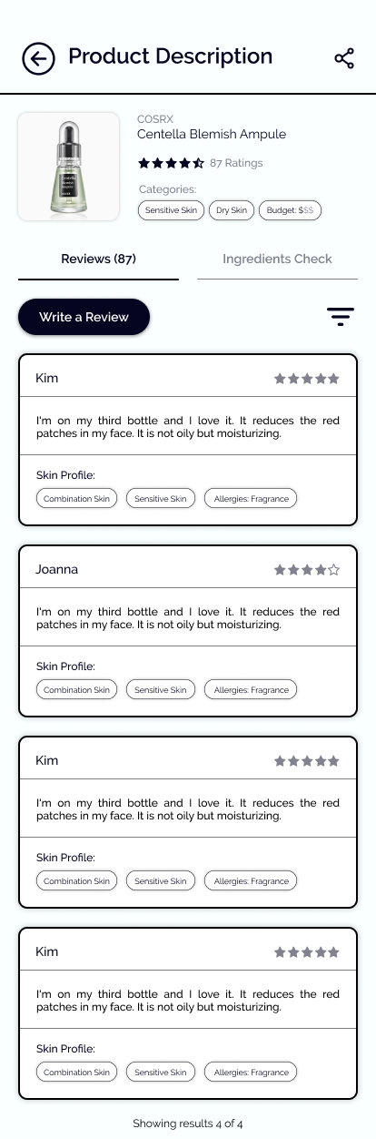
To fit this need, I created a comment section for each product that would display their review as well as the commenter’s skin profile.
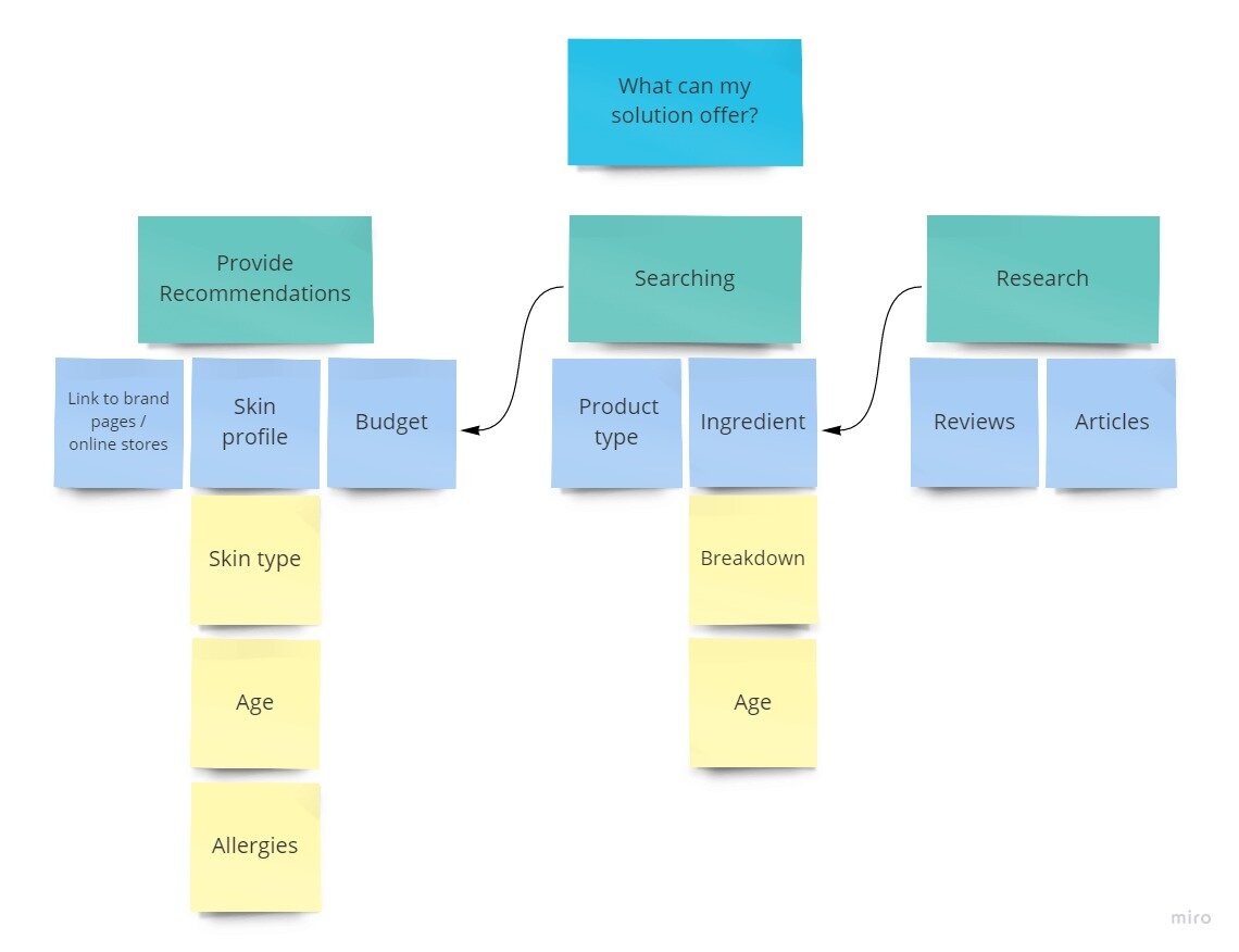
Another insight was that:
People want to understand what they were putting on their skin yet they have no idea what most of the ingredients are for.
So I had to place a feature within the page that would explain the purpose of each ingredient in the product. My final insight gathered was that:
When users encounter negative reactions to the product, their next action is to stop using it and to read up on what they should do to soothe the irritation or avoid further damage.
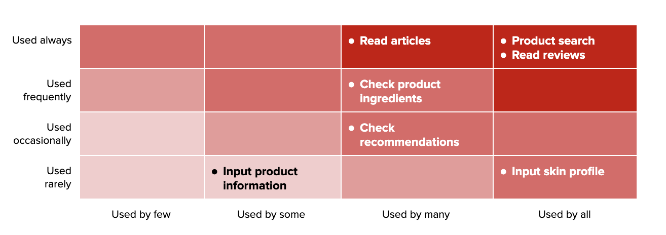
A comments section would provide a place where users can read up on various tips and tricks and suggested product usage. Each user insight now had a corresponding feature. I then broke down the features into sub-tasks and ranked their importance to all the personas using Red Routes. I implemented the most critical features in the prototype, which are highlighted in the upper right corner of the table.
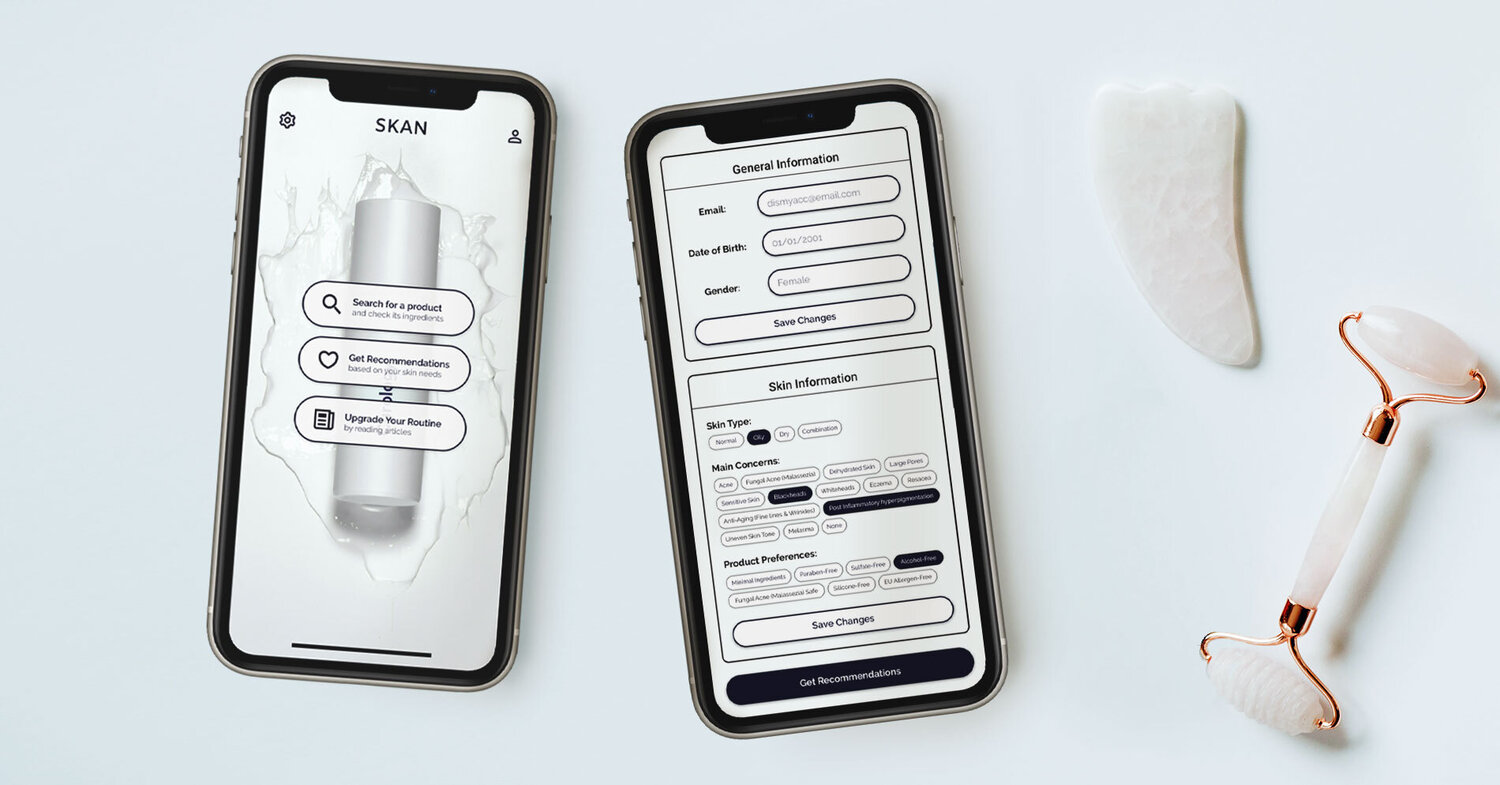
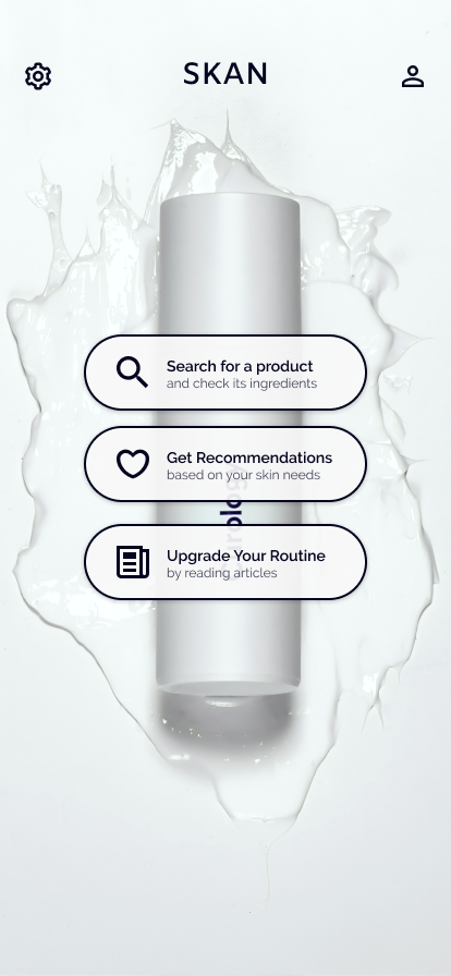
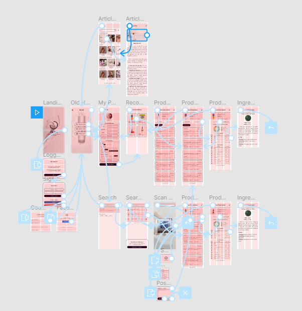
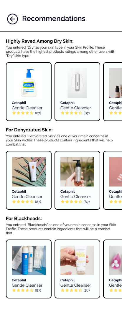
To develop the prototype, I used Figma. Below are screens of the app. Upon opening the app, the user logs in and enters the details of their Skin Profile. Then the app displays a list of products best suited to their needs based on the Skin Profile.
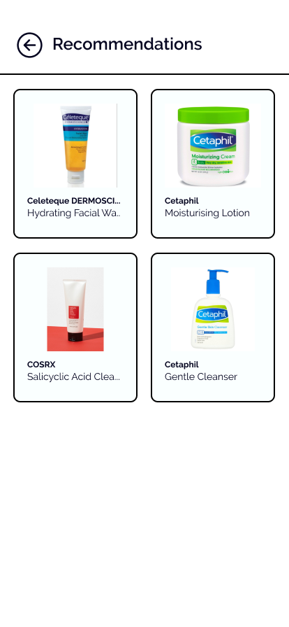
If a user wants to do more research about a product, they can click on the product in the Recommendations page. Each page has reviews from other users as well as the ingredients list of the product. The reviews will show the respective Skin Profiles of the reviewers. Users will be able to see if certain ingredients would be beneficial for their concerns.
This allows them to understand the effects of the ingredients in that product. If a user wishes to know more about how to get the best use out of a product — or get advice on how to deal with a breakout from a product— they can head over to the blog and read up on articles about their concerns.

To validate the value of this solution, I sent my prototype to twelve users— three for each persona. Due to the community quarantine, I conducted the User Testing remotely using Figma and Google Meet.
The main objective of the testing was to see if the users could accomplish each task and also see how they would interpret the task. Completion of the task is the ultimate goal but it is also vital to know:
From Testing, I was able to deduce three main pain points:
The Recommendations section needed to be categorized and have the number of ratings displayed with the product. Some users also wanted more description as to why a product was chosen for them.
Consumers expect to see lists of products or recommendations upon entering the homepage itself, similar to the dashboard of e-commerce sites.
Participants also felt that the Skin Profile was lacking some descriptions as some of them do not know what some words meant or what their skin type is.
In consideration of this user feedback, I made the necessary iterations to the prototype. I implemented the new changes by categorizing content on the Recommendations page which would help the homepage layout appear more enticing and familiar. I also tweaked the Skin Profile, to help personas like ‘Sam’ create a stronger connection with the product.
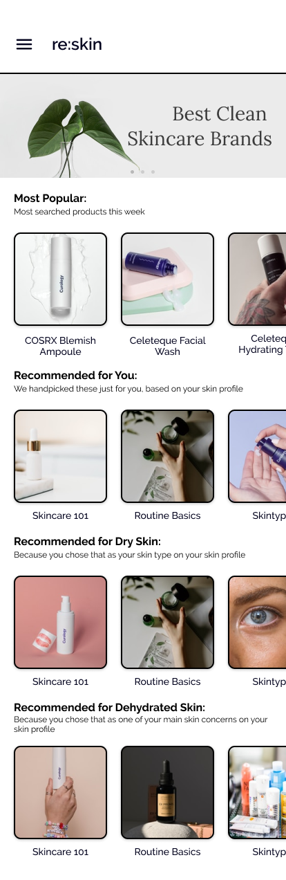
A mobile application that aims to educate users and give them suggestions for the types of products better suited for their unique skin care needs. The name re:skin is a combination of the words ‘Re’, meaning ‘regarding’, and ‘skin’. I chose to have the name in lowercase as it gives off a more approachable and friendly vibe.
The next step for this project would be to have another round of User Testing, in order to validate the latest iteration and cater to the other personas. Additionally, the ‘Ingredients Breakdown’ section could be more comprehensive in the terms of the content and product explanation. I would also like to explore the use of forums as a way for users to communicate with each other on the platform.


