
After Typhoon Uwan passed, many of us were left without power or internet. In a stressful situation like that, the last thing you want to fight with is a confusing website.
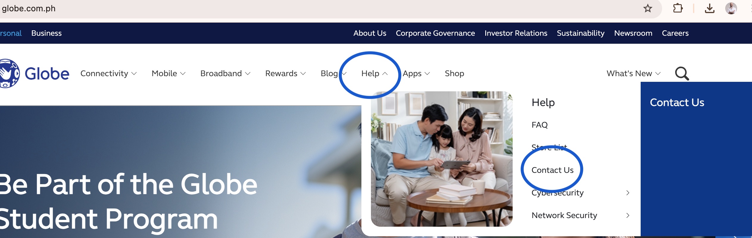
When I needed to report an outage, I went to Globe's website (opens in a new tab). I did not have to brace for a long, frustrating search. I found the Help section and the Contact Us page immediately. It was quick, simple, and painless.
This ease of use is not an accident. It is the result of a powerful, invisible principle: Information Architecture (IA).
Information Architecture is the "blueprint" of a website. It is the practice of organizing and labeling content so that users can find what they need, complete tasks, and understand where they are. In a crisis, good IA is not just a convenience; it is a critical part of customer support.
Globe's website is a perfect case study in IA done right. Let's break down why its main menu is so effective.
First, look at the top-level navigation bar. The main categories are:
These labels are simple, single words that anyone can understand. The site does not use confusing internal terms. My own experience proves this: when I needed support, the Help label was the obvious, correct choice. This clarity removes guesswork and immediately guides users to the right section, which is exactly what you need during an emergency.
An additional good point is that it was not hidden away in a footer menu at the bottom of the website.
The dropdown menus do not just dump a dozen links on you. They follow a smart, logical pattern by grouping related products and services.
This structure allows you to "drill down" to the specific area you need without getting overwhelmed.
Look at the Mobile menu. It first groups links by the main product or plan: Prepaid, Postpaid, Platinum, and International. A user can instantly self-select the main category they belong to.
Then, within the menu, it creates a new heading for Prepaid and lists related sub-products or services: 5G SIM, Phones, Loading, and Promos.
The Broadband menu does the same. It first groups by product: GFiber Postpaid, GFiber Prepaid, and Home Prepaid WiFi. It then creates a heading for GFiber Postpaid and lists related services or actions: Plan Upgrade, Home Squad, and Auto-Pay.
This "top-level product, then sub-level" structure is incredibly effective. It anticipates the user's need to get more specific and guides them directly to the next logical step without causing confusion.
This kind of intuitive structure does not come from guesswork. It is built from understanding how real users think (see Jared Spool (opens in a new tab): 'the opposite of user research is guessing'). The single most effective method for achieving this is card sorting.
Card sorting is a user experience research method that helps you design your site's IA.
When you see multiple users grouping "Promos" and "Loading" together and calling that group "Prepaid," you can be confident that this structure will work on your website. This process builds the site's navigation around your users' mental models, not your company's internal structure.
There are great digital tools to run these studies, such as OptimalSort, which is an industry-standard application for this.
The best Information Architecture feels invisible. You do not notice it because you never get lost. Globe's website is a fantastic example of how investing in a solid, user-researched structure creates a better experience for everyone, especially when they need it most.
If you want to learn more about how to conduct this kind of research and design user-friendly products, you can learn more in our UX course at www.getuxcertified.com (opens in a new tab).


